Beautiful Scholar: A Display Font That Adds Charm Without Compromising Clarity
I was deep into the final round of tweaks on a new landing page for a small creative coaching practice—calm, intentional, and deeply human-centered. The client’s voice was warm but authoritative; their work bridged mindfulness and professional growth. As I previewed the hero section on desktop and then tapped over to mobile, something felt off. The headline font had presence, yes—but it didn’t *breathe*. It leaned too hard into austerity. So I swapped it out for Beautiful Scholar, and instantly, the tone shifted: grounded, inviting, quietly confident.
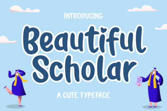
Beautiful Scholar is a display font with soft curves, balanced contrast, and just enough personality to feel handmade—without slipping into whimsy. It’s not a script or a handwritten font, but it carries that same gentle rhythm in its letterforms: open counters, friendly terminals, and a subtle warmth in the lowercase ‘a’, ‘g’, and ‘e’. It’s bold where it needs to be, but never aggressive. In digital layouts, that balance matters—especially when you’re asking someone to pause mid-scroll and connect with a message.
In this project, I used Beautiful Scholar exclusively for the hero headline (“Clarity Begins With One Honest Conversation”) and the two primary section headings—“How It Works” and “What Clients Say.” Everything else—the body copy, bullet points, form labels, navigation—stays in a clean, highly legible sans serif (Inter, loaded via Google Fonts). That pairing works because Beautiful Scholar doesn’t try to do everything. It’s designed to lead, not to explain. And that’s exactly how a great display font should behave in modern web design.
On mobile, I tested readability carefully. Beautiful Scholar holds up well at 32px on iOS and 36px on Android—just large enough to preserve its charm without crowding the viewport. I avoided using it below 28px, especially on buttons or secondary CTAs, where clarity trumps character every time. For image overlays—like the soft-focus background photo behind the hero headline—I added a subtle text shadow (1px black at 20% opacity) to ensure contrast stayed strong across devices and lighting conditions.
It’s also worth noting: Beautiful Scholar isn’t built for long paragraphs or dense interface text. You wouldn’t use it for pricing tables, feature lists, or legal footers—and that’s by design. Its strength lies in moments of emphasis: a course title on a sales page, a boutique shop’s seasonal banner, a portfolio site’s featured project label, or the tagline in a digital brand kit. I’ve seen it shine on fabric print mockups for merch, too—its rounded forms translate beautifully to physical textures.
For layout performance, I made sure the webfont files were optimized. Beautiful Scholar comes in WOFF2 format (the most efficient for modern browsers), and I loaded only the weights I needed—Regular and Bold—via `font-display: swap` to avoid invisible text during load. No flashy variable axes here, but that’s fine: this isn’t a utility font. It’s a deliberate accent—one you choose with intention, not default.
Pairing is where Beautiful Scholar really sings. With a neutral sans serif like Inter, Poppins, or even a refined serif like Cormorant Garamond, it creates visual hierarchy without tension. On a blog redesign I recently helped with, we used it for post titles and category badges, while keeping all article text in a relaxed serif for editorial warmth. In another case—a product landing page for a ceramic studio—it anchored hero banners and collection headers, letting product photography remain the true star.
Licensing is straightforward: Beautiful Scholar is a commercial font, fully cleared for web use, client projects, SaaS dashboards, and e-commerce platforms. It includes Latin-based multilingual support (covering Western and Central European languages), so it scales gracefully across English, French, Spanish, and German interfaces—no missing accents or awkward fallbacks. There are no stylistic alternates or swashes, which keeps things predictable and accessible—especially helpful if you're building reusable design system tokens or Figma components.
One thing I appreciated during testing: its consistency across rendering engines. Some decorative display fonts look crisp on Chrome but soften on Safari or blur slightly on older Android versions. Beautiful Scholar stays stable—no unexpected hinting quirks, no inconsistent baseline alignment between headings and buttons. That predictability saves time in QA and builds trust in your brand’s digital polish.
Of course, context is everything. Beautiful Scholar wouldn’t suit a fintech dashboard or a cybersecurity whitepaper—it’s not meant to project cold precision. But for a yoga instructor launching a new retreat series? A freelance illustrator updating their portfolio homepage? A small-batch candle brand rolling out a spring campaign? Yes—immediately. It adds humanity without sacrificing professionalism, elegance without pretension.
I also checked how it performed in dark mode. With a light-weight variant (if available) or careful background contrast, it adapts cleanly—though I’d still recommend sticking to the Regular weight on dark backgrounds and increasing letter-spacing by 0.5px to maintain airiness. And for accessibility, I kept all Beautiful Scholar usage to large, short-form text with sufficient color contrast (tested with axe DevTools)—never for UI labels, error messages, or interactive elements requiring fast scanning.
At the end of the day, typography is one of the quietest yet most powerful tools we have to shape how people feel before they even read a word. Beautiful Scholar doesn’t shout. It leans in. It invites. And in a web landscape full of sharp edges and algorithmic urgency, that kind of calm confidence is rare—and deeply valuable.
- Best for: Hero headlines, section titles, campaign banners, course names, logo lockups (as part of a logotype), social media cover graphics
- Avoid for: Body copy, data tables, form fields, small buttons, navigation menus, long quotes
- Pair smartly with: A neutral sans serif (for UI clarity) or a refined serif (for editorial depth)
- Test before launch: Mobile line-height, dark-mode contrast, loading behavior, multilingual character coverage